Overview: A Project Taken on during UX Academy where I chose the ‘learning a new skill’ prompt. I wanted to find out if there was a particular need within the amateur gardening community
Timeline: 3 Months
Role: Researcher, Designer, Prototyper
Tools: Figma, Microsoft Office Suite, Zoom, Miro
Problem: People interested in learning or honing their gardening skills found themselves hindered by the time required to get the results they desired.
Solution: Design a site that provides users with a garden guide that includes human consultation, pre-filled schedule & journal features.
Goals: Discover the pain points of aspiring, motivated, prospective gardeners and find the best ways to solve them. Properly synthesize research and test results into a design that is aesthetically pleasing while enticing users.
Strategies:
Begin with user interviews and competitive research.
Synthesize research and begin ideation through MVP model of features.
Move onto wireframing to form the layout of the product.
Prototype test based on high fidelity wireframes and iterate based on results.
GROWUP
Providing Users With the Time to Help Their Garden Grow
Research:
I wanted to learn from a range of demographics and non direct and direct competitors. We’d like to pinpoint exactly what people are most interested in learning and how much attention they would like to give so that we know what services to highlight.
The Participants chosen varied by range of age, marital status, and type of housing to find our ideal demographic(s) to create a persona. While some of the interviews may have seemed like overkill or unnecessary, I wanted to make sure we didn’t miss anything with each demographic. It helped me narrow the focus a bit as well.
User Interviews:
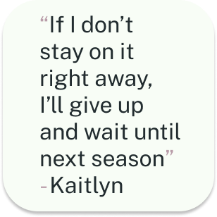
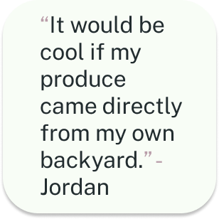
We found that space, time, succession rate, and the pursuit of a healthier lifestyle are all important to the interviewees
Results:

Competitive Research:
Garden Answers

Garden Manager
Planter

Garden Planner Territorial Seed Co.

Upon my initial research there are lots of direct and non-direct competitors out there for the concept of Growup. I narrowed down the ones that had features closest to what I’d like to implement for GrowUp. Most of the competitor’s I chose provided one specific service while having other features that may only be accessed behind a paywall. It proved to be an almost entirely digital medium. Not much of a human-to-human feature amongst these competitors. It was a lot of non-direct competitors. Providing one specific service while having other features that may only be accessed behind a paywall.
Ideation
Personas
I was able to synthesize user research results into a specific persona. The persona covers all of the most important information gathered from the user interviews. I ended up focusing on the current working class. You could say millennial to be hyper specific, but I feel like that word alienates the fact that I am developing this service to be useful for all demographics. While everyone can and should benefit from GrowUp, I based my persona off of the demographic would initially benefit the most from the service, based on the research.
POV & HMW
After getting my ideal user persona figured out I took the next step to develop a solution to some of the users problems. I brainstormed by writing a few HMWs and POVs and chipping away by narrowing it down to the one that seemed to make the most sense. Taking a MVP approach I wanted the HMW & POV to reflect the research while also paving the way towards the first features of this service.
POV
I’d like to explore ways to equip users with gardening knowledge based on location, climate, and general wants without taking up too much of their time so that they stay confidant pursuing their goals
HMW
How might we provide people with resources that result in their desired output while only taking the time they would like to use on gardening?
Feature Road Map
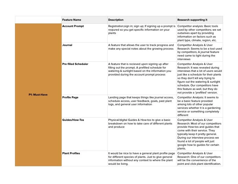
After synthesizing the data from my research, I created the Feature Road Map. I chose things based on what users seemed to want the most, feasibility, and how we could improve from our competitor’s. We broke down each feature and added them to categories like Must have, Nice to Have, Surprising & Delightful, and Can Come Later. Again because we chose to use an MVP model, my idea of wanting to focus on human contact had to take a back seat for other features.
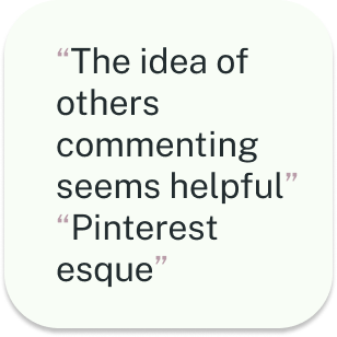
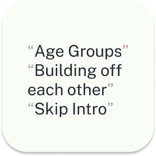
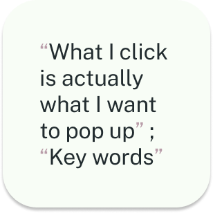
Card Sorting
5 participants
Their user habits gave me some idea on how a first time user could become a regular user of the site.
We used the data to know where to start with our website layout. Where to put each feature.
Half were conducted in person while the other half over zoom
I allowed users to create their own categories.
I oversaw the participants during the card
sort. Followed up by a few questions
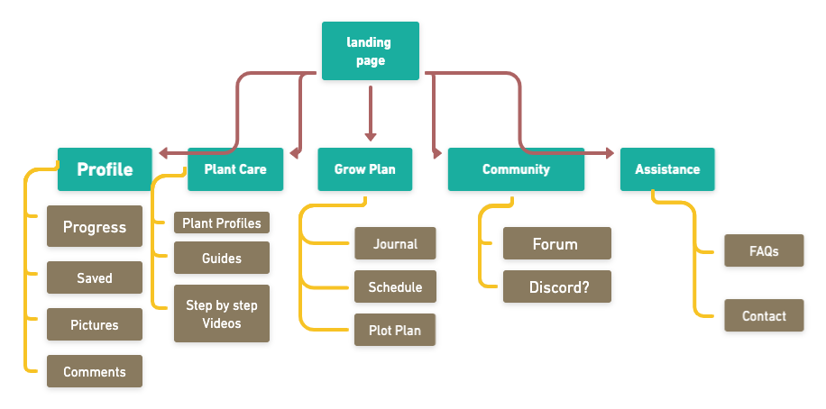
Site Maps
The site map became an easy task after analyzing other sites and our user’s cardsorting data. This proved to me that the more research the better. It also helped me really grasp the power of asking open ended questions and letting people talk. Most of the data that I obtained by listening to each user was used to make the site map most.
Task Flows & User Flows
Moving on to user and task flows after mapping out the site seemed like the next logical step in formulating the shape this service would take shape online. User flows and task flows both help me start to envision what the layout will look like and what the user experience will be. I tried to choose flows that would exhibit initial features that would be available to users upon first use. While the dream for GrowUp! is to encourage personal in-person or online coaching with a horticulture professional, and since I am on a time crunch, I am approaching GrowUp! with the MVP model. Front loading the easiest to make features will give me time to fully perfect the more complicated coaching features.
*Click on each flow or these links below to get a better look at what steps we considered for each!
User Flows
Find a plant
Sign up for Grow Up
Task Flows
Even though the user flows were much more helpful than the task flows in that regard, It was good to get to know when one can be more valuable than the other. Task flows still helped me visualize what the design would look like in my mind. Which helped visualize exactly what links would take you where and information architecture.
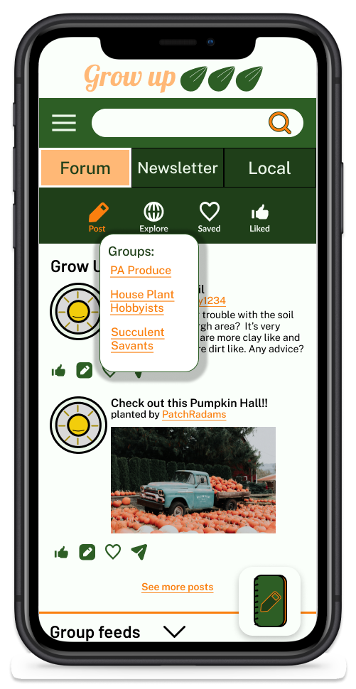
Make a post on community forum
Onboarding Survey
Design
While most of the user and task flows did not end up being used for wireframes, they got the juices flowing when it came to how user’s will actually use the site. Which helped the design of the site. At first, I found it difficult to choose what to make for each type of flow because I wasn’t sure what I wanted to showcase for my user’s to test at first. I ended up choosing tasks that would be the most important ones for users to get an idea of how they would work the site.
Click the fidelity titles to get a better look each phases
Wireframes & Wireflows
I had to factor in time to make each set of wireframes and flows so not everything initially thought of made the cut. I chose to do mid fidelity in desktop size so that a responsive version had been thought out to an extent and would make figuring out the desktop layout easier later. It was also a good exercise of spacing, placement, and which order to place the information and features in.
The goal of the high fidelity wireframes was to successfully the research and design principles enough to create wireflows, create prototypes, and conduct usability testing. The colors chose were to help create an academic feel , mimic the colors of a garden, and be welcoming to any new user. When learning something new or honing a skill, the user should feel comfortable and the community should feel inviting.
High Fidelity
Prototypes & Usability tests
I was pretty overwhelmed by designing the high fidelity sites and doing a break down of different sites and apps I use helped me a lot. I loved the idea of finding the styles that work and making them your own. My process went from trying to invent something new to not feeling like I had to reinvent the wheel. When that clicked the design process felt a lot less daunting.
All users fit the persona
1 Married user
1 single user
2 couples
1 tested separately
1 tested together
Tasks:
Post a comment
Post on community forum with picture
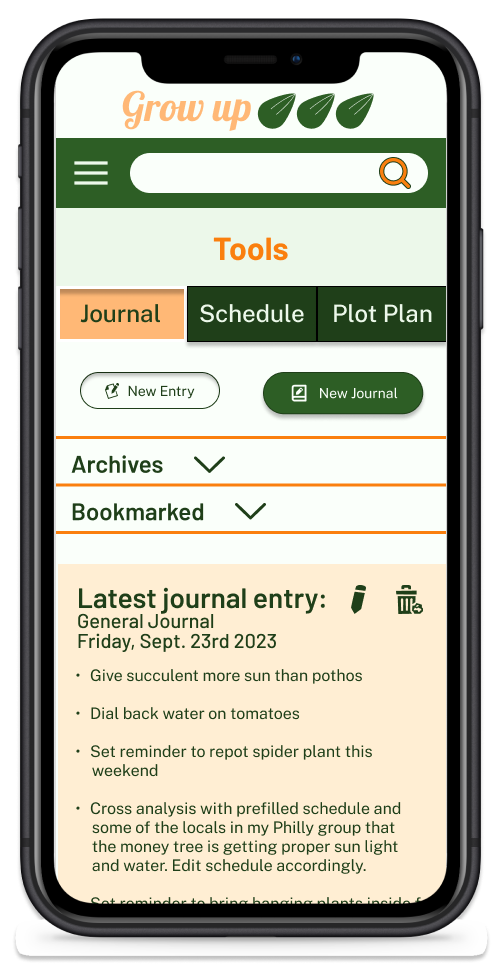
Make journal entry
Usability Test Results
Questions:
Meaning of Grow Plan
Why breadcrumb menu
Where’s Journal?
What does this word mean
Worked:
Journal Icon
Hamburger
Title
Change:
Journal icon (Placement & Visual)
Breadcrumb menu
Language
50% of users were drawn to the journal Icon. The other 50% said it could be beneficial to label the icon further
50% of users were drawn to the hamburger menu based on how they navigate through sites they are familiar with
Almost all users had some slight difficulty with hamburger menu
Almost all users said some of the hamburger menu language could be improved
All user’s enjoyed the layout and did not find the navigation overly difficult, but had feedback for improvement
Ideas based on results
Add + sign or pencil to journal icon
Change ‘user’ to community or user’s name
Make Hamburger menu one page
Rearrange pages so you do not have to keep accessing hamburger menu. Matching other pages
Conclusion
Growing as a Designer
Interviewing a wide range of people for user research can create a more specific persona. I believe surveys could have gotten the same results as a cardsorting exercise, but cardsorting did allow a closer look into the thought process of the user. After this project I found that allowing usability testers to have maximum exploration of your prototype, while still under supervision, can reap insight that I would have completely looked over. Also, while person-to-person contact is usually appreciated by a user, it is rarely sought out. Usually used as a last effort by a user.
I battled with imposter syndrome, time management, and decision making during this process. While I have mastered time management and decision making in other fields, it was a humbling experience to be so unpracticed at something. I still had to trust your gut and be confident in the decisions I was making. I learned that there are sacrifices that come with your project as you collect data from research. These sacrifices are typically made to solve the actual problem. It became a skill that was developed of letting ideas go, even when I really didn’t want to. If it did not serve the user right away then it is probably worth shelving for the time. This was my first real crack at something within this field. An experience that left me feeling confident in my ability to work through every step of the design process.