Add a Feature
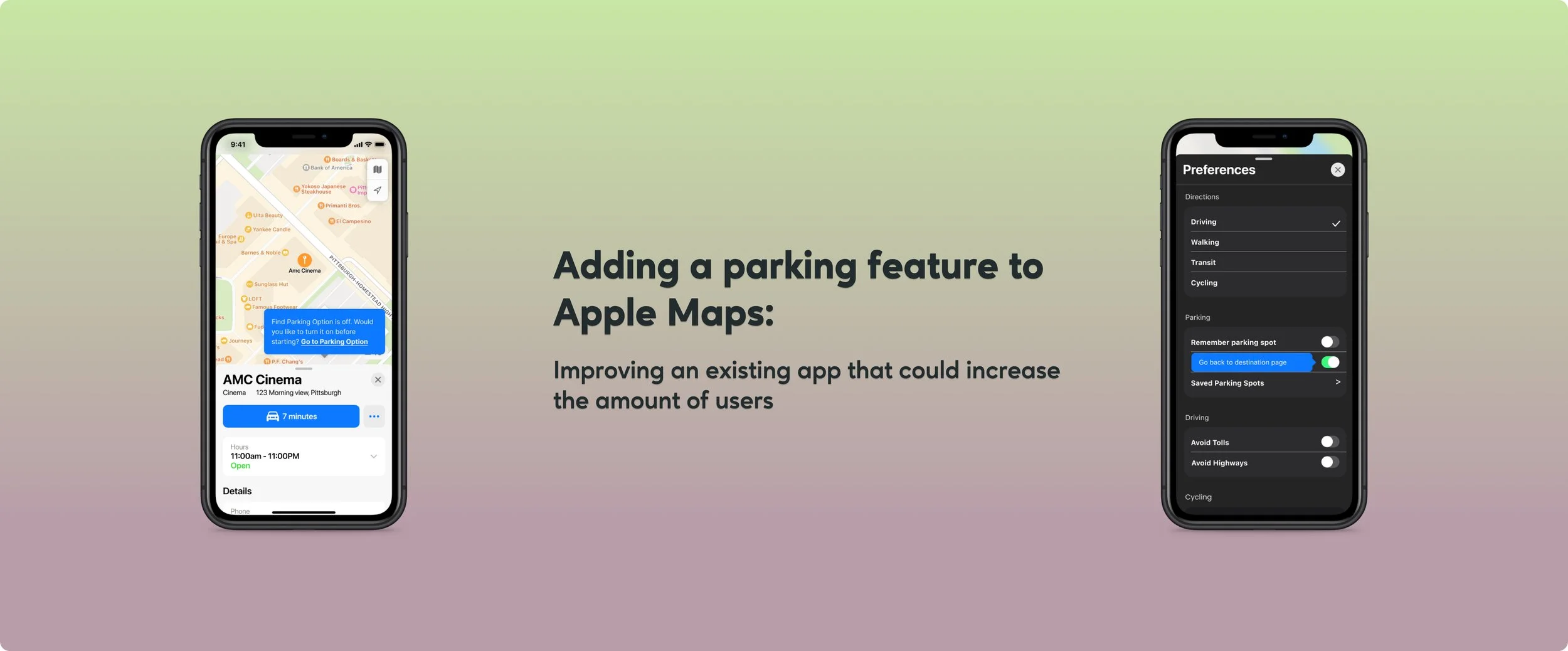
Adding a Parking Feature to Apple Maps
Overview: adding and refining a parking feature to Apple Maps so it can have a distinct feature that sets it apart from the more popular navigation apps
Problems: While navigation apps have options for finding parking, they usually require extra work from the user. Some parking perks also require the user to have a car that connects to their phone. Apple Maps is not a top choice when it comes to navigation apps. After conducting research it seems like a reliable parking feature could sway people to start using Apple Maps more often. While there are also apps just for parking you still have to get out of the maps app and open a second app. Which seems like more trouble than it is for worth for users.
Solutions: Develop parking feature to Apple Maps that successfully makes it easier and faster for users to find parking spots.
Strategies: I will be developing tride and true strategies that I have used on other projects. Which means I’ll be conducting interviews, looking at competitor’s, and testing the feature through prototypes. I would like to use this project to do some different things as well. I would like to send surveys out, develop wireflows instead of just wireframes, and make sure each user has a different driving background.
Goals: Refine my research abilities and develop a feature that user’s feel successfully integrates wall the already UI of Apple Maps. These goals will align with pinpointing existing user’s issues and developing solutions that make the most sense.
Timeline: 3 weeks
Role: Researcher; Designer; Prototyper
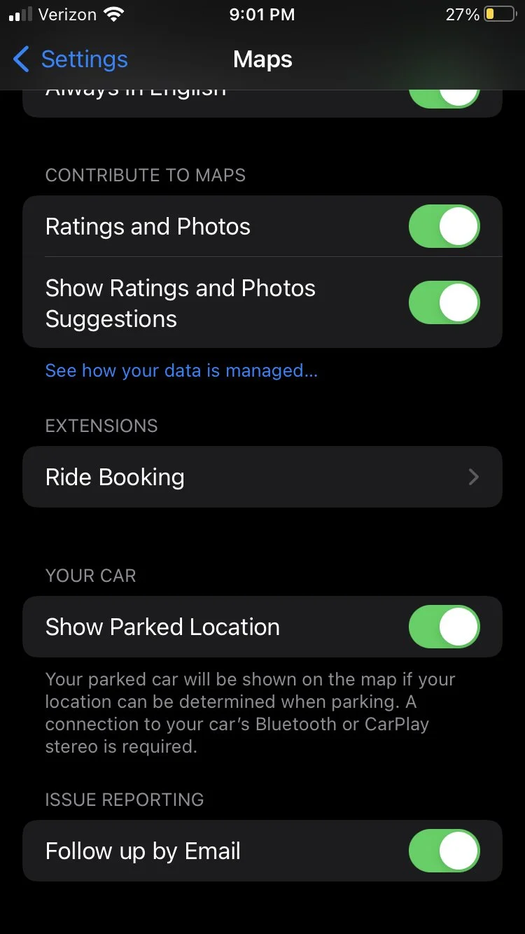
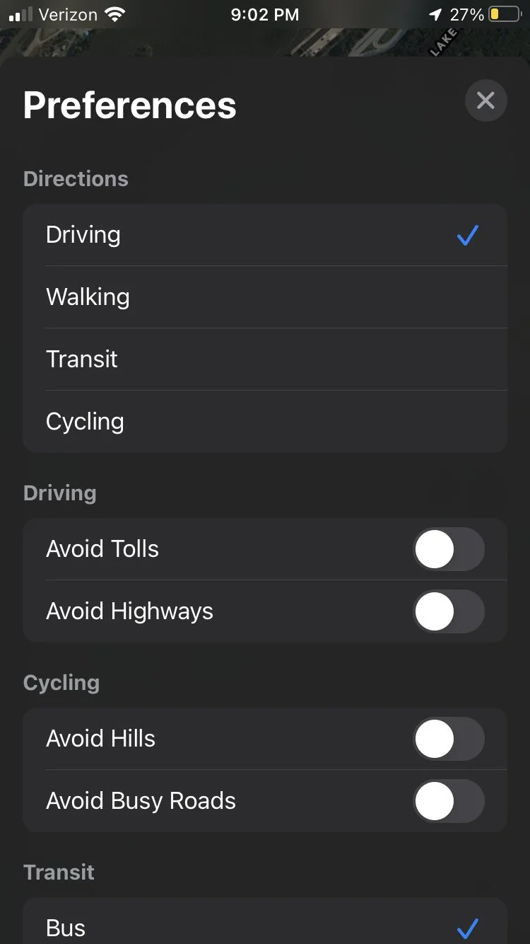
Tools: Microsoft Office Suite; Figma; Apple Maps
Research:
User Interviews:
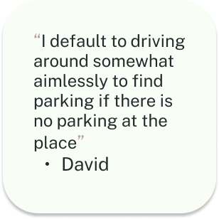
I chose different demographics so that I can obtain the widest range of experiences. The users that I picked drive for work, commute to work, have moved to new cities within the last 5 years, or use a navigation app on the regular. This will help me get to the core issue and needs of the user when integrating a ‘parking’ feature to Apple Maps. I wanted to make sure users had actual issues with their navigational apps and where I could find the most helpful solutions.
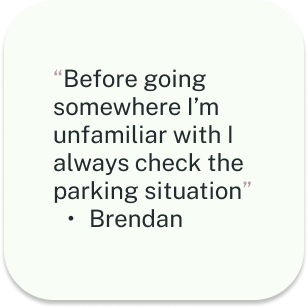
I found that across the board most users had safety in mind for where they could park. The older demographics leaned towards convenience and the younger demo focused on cost. All users opted into using a navigational app that provided real time updates. Everyone except one user checks for parking ahead of time. Some users even said that they would spend money if it were convenient enough as well. Even if the cost was more than they liked.
With all this information and more, it became easier to focus on user issues at hand and taking the next steps to find the best solutions.
Survey:
Conducting surveys was something I had not done for previous projects and seemed like a faster way to get even more perspective on user issues and taking the correct steps in solving them.
Competitive Research:
Conducted competitive research by using and exploring google maps, waze, and some current parking apps. I did this by using each type of navigation app to get around for a couple days at a time, exploring each apps features (their parking features, alt. routes, etc.), and side by side analysis to see if there were any big differences in interface. I found that Apple maps requires some digging into different functions and is very straight forward. While this sounds good, it seems to get overshadowed by all the different things a user can modify on google and waze. It was not user friendly while the navigation to the destination was happening.
Tap here for a more in depth look at the analysis of competitors
Results:
Most participants drive often
50% participants used google maps while the other 50% were split between apple and waze
90% of participants check parking ahead of time while only one said they never did
Only one participant said ‘they don’t often check parking situation ahead of time’
100% participants disliked parallel parking to a degree
50% of participants feel only somewhat satisfied after using their navigational app of choice
50% of participants use navigation apps every time they drive somewhere
90% of participants do not choose apple maps as their navigational app of choice
50% of participants are not familiar with Apple Maps and the other 50% are only somewhat familiar
80% participants decided they would switch to another navigation app if it had a better parking feature and then justified their answer with explanation
Ideation:
Wireflows:
Combining task flows and mid-fidelity wireframes to expedite the ideation process. Since Apple Maps already exists it was helpful to base wireflows off of the apps current layouts. I had not actually performed a different strategy outside of just wireframes until this project. It was a good way of learning a new trick and helpful when it came to prototyping. Wireflows were helpful in the process of integrating the new pages’ designs to mimic Apple Maps as closely as possible for our prototypes. I treated them as almost a mimic exercise to sharpen my design skills.
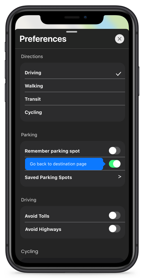
Tap on each of my midfi wireframes to better see how I prepared to assimilate to Apple Maps existing UI
User Journey Map:
This was another new exercise I conducted. It became a creative way to synthesize research while also picturing solutions to user’s pain points. Since this project was not as intensive as the others, I felt comfortable learning exercises I wasn’t as familiar with. While at time’s I wasn’t sure if it was actually necessary, in the end it did end up being very helpful. It allowed research to be applied while coming up with solutions that could be applied when prototyping. The scenario for the user journey map was easy to think of after conducting user interviews. I took little bits of information that seemed like the most reoccurring during the interviews and used them to create the scenario breakdown.
Click this link or on the User Journey Map I created to get a better look!
Design:
Prototype:
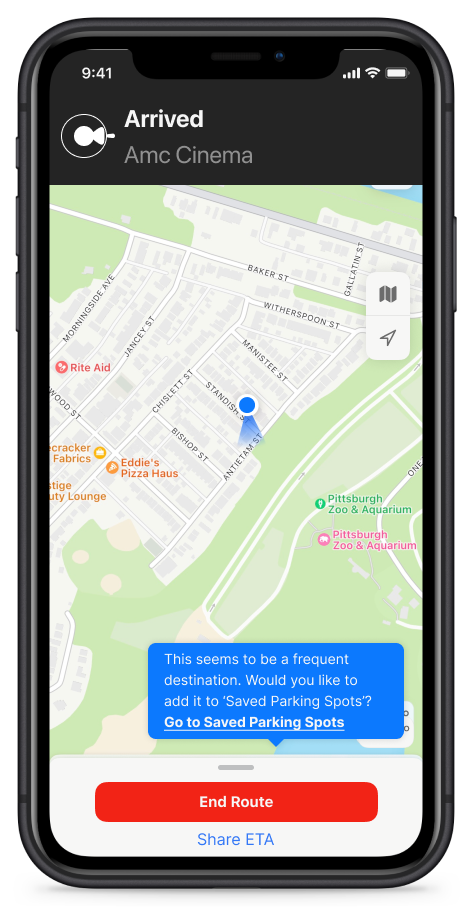
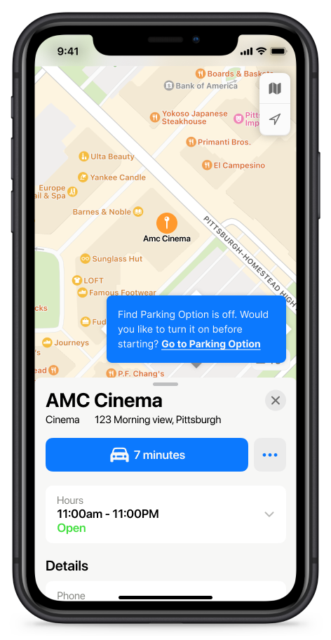
The next logical steps we took were to make high fidelity prototypes based on the mid fidelity wireflows. Typically I would consider wireframing in the design aspect of a project, but since the UI for Apple Maps already exists it seemed more appropriate in the ideation category. The wireflows were mainly used to get an idea of the steps a user would take to use this parking features. I tried to pick tasks that would be the most frequently used parts of the parking feature. I went back and forth initially on deciding font color for some of the new pages. Before testing I did not realize I was making extra steps for users. The results helped short some of the tasks.
Tap on each screen to get a better look!
Testing:
Subjects completed three tasks.
Using the navigation app with the ‘find parking spot’ feature toggled on
Turn the parking feature on from the destination page
Add a frequently visited parking spot to your saved parking spots
Results:
We found that users enjoyed all aspects to the feature but we could make some of the tasks a little tighter with less steps and make things more clear by upgrading the language used. I did my usual breakdown of results into a few different categories. This helps me when referring back to results.
Worked -
Matching Design & Flow that feels like Apple Maps
Messages
Details in parking options
Saved parking spots
‘Nicknames’
Questions
‘Why are there 2 X’s?’
“Does the 7 minutes on that button mean go”
“Is the task complete?”
“Is there any way to add a heart icon?”
“Is there any way to skip the steps of adding a spot and have it a one click add?”
Change
Change language with some buttons and categories
Change message pop up design and language
Iterations:
Upgraded language and abbreviated steps based on usability test results. So some tasks were shortened and some were rewritten to increase inclusivity by making it more accessible.
‘Saved spots’ was changed to ‘saved parking spot’ after we had five tests.
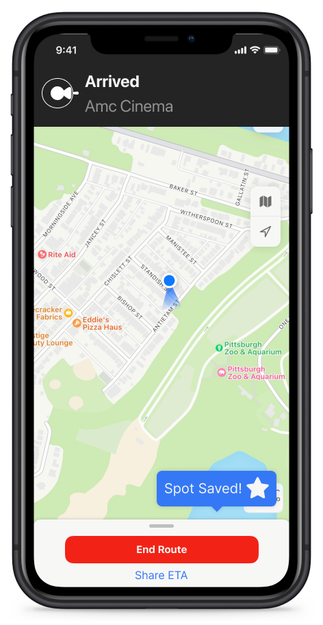
We shortened the ‘save a spot’ task by making it so the message said ‘save a spot?’ with a heart icon.
I had trouble finding a ‘heart’ icon that matched the apple format so I changed it to a star.
Make a one click ‘heart’ option for adding a spot and let users edit it later
Get rid of X’s and choose different ways to close message
Update language on messages so that it is more direct resulting in users saving time
**Click each screen to get a better look!**
Future:
I thought process wise this project came together really smoothly. In the future I would hope to survey more people. People’s answers ended up being very insightful and influential with how the rest of the project went from that point. The wireflows also helped shaping what the tasks for the prototype would be. They provided with me good insight for how to approach other projects.
These takeaways included:
If a feature works; users will interact with it further(take extra time to edit)
If a feature works; they will become regular use in the navigation process
Pop up messages work well but need to be as direct as possible
Simplicity is key even if it doesn’t look super slick
Users like being reminded of when important features might be off
Less savvy users won’t know where to go if you do not tell them or lead them
In general it was a good project for potentially working for a well established company one day. There’s always room to improve even if you are a mainstay in the industry.