SceneKit
An End to End Application
Timeline: 5 weeks
Role: Researcher; Designer; Prototyper
Tools: Microsoft Office Suite; Figma
Overview: Developing an application that successfully connects local musicians and venues to each other to build a stronger community of artists that range in skill level and interest.
Problems: Interviewees had issues with venues, connecting with different kinds of artists, and finding new people to play music with. They felt deflated by the typical social media resources, having schedules too busy to meet people at shows, and have trouble getting in touch with venues.
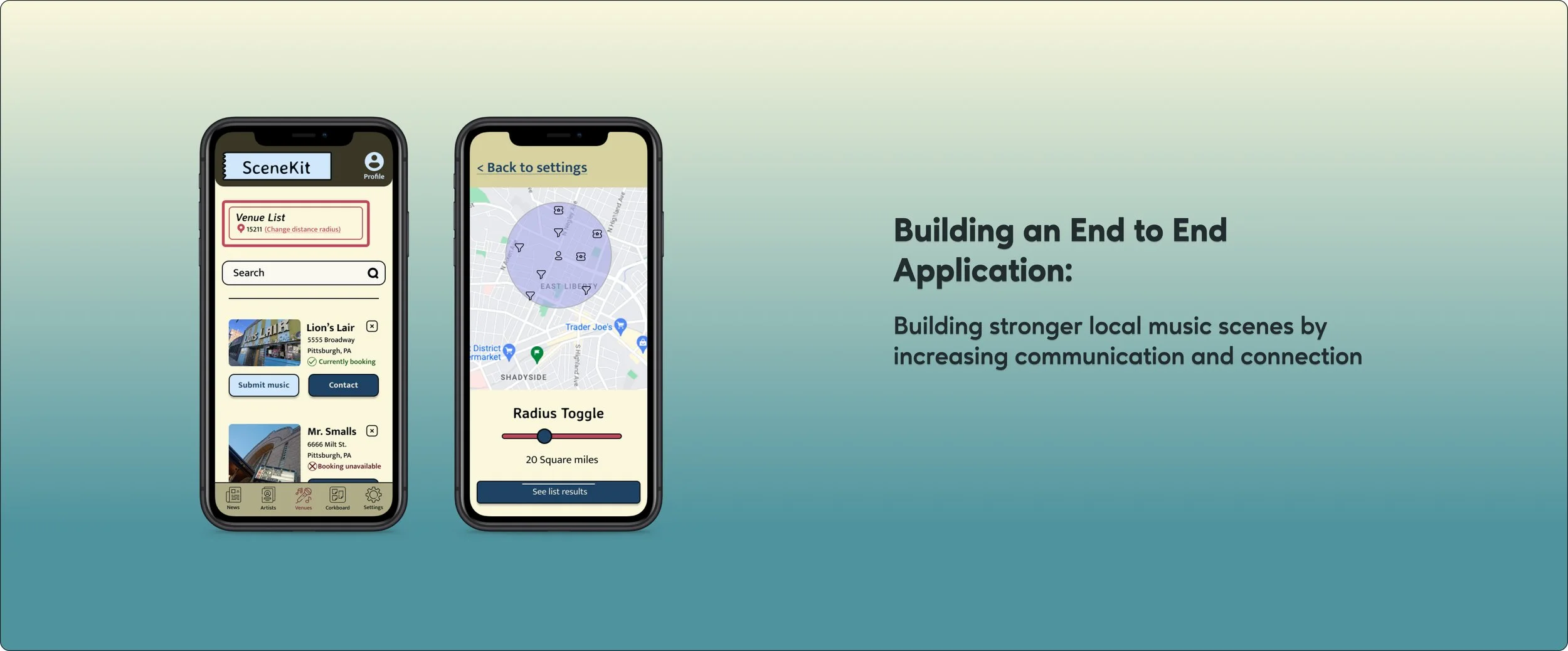
Solutions: After interviewing a range of different types of musicians, I found there were multiple problems. It felt like making an all encompassing application could be a virtual swiss army knife for local music scenes. We could keep it as local or as large as the user would like by having a distance radius tool similar to other apps like zillow or tinder.
Strategies: Building out prototypes that mimic the key features for each type of user. Having users test prototypes so they can be built out as best as possible.
Research:
Explore non-direct/direct competitors that have one or multiple features as the current application.
Interview a range of different types of musicians so that I can pinpoint the needs of all types of users.
Conduct an importance vs frequency survey so that there is data to help with the app’s feature’s hierarchy
Goal:
Because we are using an MVP model, it is important to find the features that will be solutions to the users’ problems while functioning to help build up the local community of artists. The strategies I listed above should help best with pinpointing users problems and finding proper solutions for them.
User Interviews:
I chose different types of musicians so that key features and problems were pinpointed. This helped me focus on what problems need to be solved upon release of the app. These interviewees all had a musical background in some capacity. From DIY style musicians who play more independent venues to studio musicians who regularly play promoted shows. I also touched base with hobbyists musicians who enjoy a creative outlook with a community of people to bond with.
While everyone had their own, unique takes and opinions, them seemed to funnel into similar categories. All candidates had a varying disdain for social media sites. They talked about them like it was a necessary evil. The same way artists who oppose Spotify still feel the need to have their music on the website because they can’t afford to not be available to stream. Other pain points included: not really knowing who you are booking or collaborating with, not knowing if someone online is just a spam or scam, the process of constantly reaching out to venues multiple times just to play a show, overall not being able to make a connection with someone you agree to work with ahead of time which results in the art/work suffering.
Want to get to know our users more? Click here for a deeper look at each user
Competitive Research:
These are the competitor’s I explored. Most of them have one primary feature that they mainly focus on. There are secondary features that all seemed to be in early or beta stages. I noticed that most of the competitor’s would only be helpful on a more national level, ignoring local music scenes. These competitor’s operate on a ‘prime’ or paid for version that allows users advantages and more features. Similar to Linkedin. Some of them clearly have dealings with spam users that can hinder real connection and trust of the user. It overall seems good for bigger cities(New York, LA, etc.) rather than slightly smaller cities that could get more use out of the service.
While these services all seem useful and can be used for good, it seems that they are mostly just another payment a musician has to make. When asked about the sites during user interviews, I did not find any candidate who used any of them. They are designers in their own right so most were familiar with Upwork. Only for design jobs though.
Interested in reading more? Click here to get more details about Scenekit’s competitors
Importance vs Frequency Surveys:
I wanted to figure out what potential features mean to each type of user and the how much to focus on each feature. Because I had trouble picturing what the site would look like, I believed more research was the way to go. I actually did this during the wireframe stages of the project. It helped set up the proper hierarchy for where the app’s features should be placed. Once the features were chosen and the survey explained to the candidates, I obtained data that became very useful. While no one’s answers varied too much, there were some surprising choices. For instance everyone, but Richard, had interest in artist database. Across the board people thought profile and settings were important. Each of the answers really reflected the type of user who would potentially use this app. I made charts for each of the participants to help present the data in a simple, aesthetically pleasing style.
Tap this link or each chart to take a closer to look at each user’s results!
Personas:
I developed two different personas from this research. One for each type of initial user. One being a more professional forward musicians and the other more hobbyist style. My interview candidates all reflected each one or were a mix of each one so it made sense to create two personas. As the applications features grow I believe types of users will grow which will then result in even more personas. I believe producers and studio musicians could eventually find use for this app. Something that I took from the user interviews is helping build up local music communities is to not intimidate users who don’t have as much professional experience. Some users aren’t able to make it out to shows regularly or just want to jam and meet new people with similar interests. The research proved that users will differ depending on age, interest, and passion.
Tap each persona to get a better look at them!
Ideation:
Task & User Flows:
I made several different types of flows. I had trouble picturing what the application should look like and this helped me start to get an idea. Based on the research, user & competitive, the design should be framed more like a tool box than just another social media platform. There was such a disdain and defeated feeling while discussing social media platforms with the users that it had to feel different. While I know that there were flows that wouldn’t necessarily turn into prototypes or wire flows, they became story boards that helped me visualize the app.
User Flows
Task Flows
Product Roadmap:
This helped me focus on what should be on the forefront of features that would need to come with the applications release. Through furthering my education it really seems like stepping up visual presentation of data is a good way to set oneself apart. So in this project I found visually stimulating ways to present data without making it difficult to understand.
Tap on the pictures or follow this link to get a look at my roadmap!
User Journey Map:
I put together a user journey Map where Scenekit did not exist and where one it did exist. To be honest, I was not sure if this would help at all. I noticed that when presenting the idea Scenekit to others, I had trouble really explaining what the app was with no visual prototype. While it was a helpful exercise, it may not have been completely necessary. All and all this ended up being a good way to visually show the app’s purpose.
Tap each image to get a better look at the maps!
Design:
Wireframes:
Early wireframes were the usual hand drawn sketches to just get my brain working in that direction. I moved on to low, mid, and then high fidelity. I designed those in Figma.
The title ‘SceneKit’ after brainstorming by going through at least twenty other titles. I wanted the title to be mainly focused on the music scene aspect. I started with ‘Freak Scene’. Another Dinosaur Jr. reference, but quickly changed realizing some people might think it is a NSFW app.
Low Fidelity
Tap each wireframe to get a closer look!
Mid Fidelity Wireflows
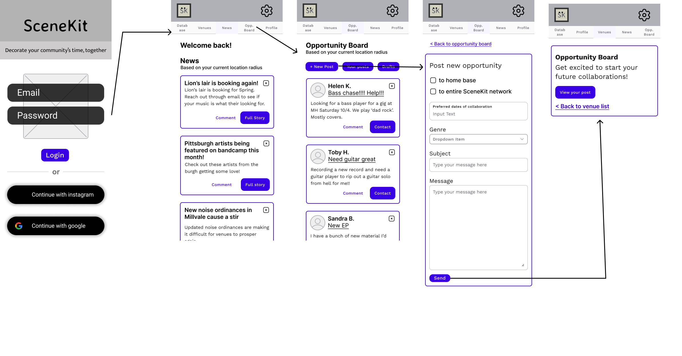
I chose to make wireflows starting with the mid fidelity wireframes to further picture the layout of Scenekit. It made the creation of high fidelity wireframes and prototypes faster. The idea for wireframes was to save time when choosing tasks for usability test participants. Knowing the layout of my tasks would more easily allow me to figure out functionality of the app prototype.
Reach Out to Venue
Adjust GPS Radius
Post on Opportunity Board
High Fidelity
I chose a wide range of colors at first and narrowed down the fonts to two sans serif choices. I chose Sans Serif knowing that it is typically make easier for all users to read. Hoping it makes it a bit more accessible. It is also a much cleaner style. With all of the user and competitive research in mind, I tried to keep it a DIY style to match the energy of the application. It needs to be a tool, like a Swiss army knife, not a social media site. My research proved that the users do not need another one of those. It should feel social, an institute of the community, a YMCA vibe. Not just another extra service that charges more for the useful features. The colors were chosen to mimic that vibe, for the professional or for someone looking to play Bruce Springsteen covers with some others. Kind of like a cork board at your local YMCA or community center.
I chose the primary heading font after doing some research and finding a font that is reminiscent of the band Dinosaur Jr. A famous historically independent, DIY band.
During the interviews a running theme was making the wrong connections. So this app should feel new, familiar, and safe all at the same time. With all of this in mind, I took inspiration from retro and vintage colors and styles. Hindering back to a time for older users so it feels familiar, but feeling new for younger users who aren’t as familiar.
*Click each wireframe to get a better look
Usability Testing:
I created prototypes for users using the high fidelity wireframes. The tasks were chosen based on the different types of users. Basically I used to the personas to help create these tasks. After some feedback, I made small iterations to the prototype like removing the boxes from each post and rounded some of the edges. This gave it a more clean, less boxy look.
Subjects completed three tasks
Find venues that are currently booking and send them a message
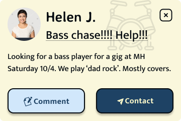
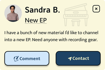
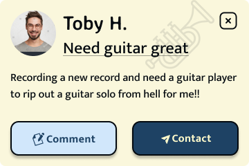
Post an opportunity to collaborate with other users on the cork board feature
Change the distance radius so that the user can see more events, artists, etc. going on around them
Results:
Each tester brought interesting points when completing the prototypes. I broke down the results of the tests in the following categories:
Worked -
Flows felt familiar with quick learnability
Colors and aesthetic
Concept
The pages & features used within the app
Questions
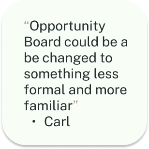
‘What does opportunity board mean’
“What is in the ‘database’ page?”
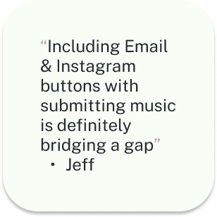
“Is the only way to contact the venues through instagram and email?”
“Does this always go straight to advanced search?”
Change
Change distance radius to make it easier to access
Change background to make it feel more like the user is moving through the page
Add a feature to just email and instagram on venue pages
Simpler icons & change language on menu
1st Iterations:
These were made based on the data from usability testing
Change icons to much simpler looking SVG icons
Make less boxy by changing shape of X’s on stories and posts
Put faded SVG graphics in the background to make the user feel like they are moving more throughout the page
Create a ‘submit music’ for venues to make it easy for venues and artists to interact
Change ‘based on your current location’ to location icon, zip code, and ‘change current radius’
Make an advanced search optional
Below are the main pages that were affected by the iterations from the usability test results. I tried to sculpt a little less outside of the social media realm, cut down steps, and allow users to be able to tell when they are moving through the page with faded background icons.
I implemented a way to ‘submit’ music to venues. The idea behind this is if a user submits to a venue it will be directly uploaded to the venue’s account on Scenekit. If a user has a ‘venue’ account when they are accepting submissions the submissions will be filed by genre and dates preferred for booking. This will make it easier to explore new artists that they can book for their shows and curate shows that will attract a larger audience.
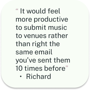
This also allows users to feel like they are doing more than just sending an email that might get a lost in a sea of other artist emails. While we still provide the option for those, this is a way to entice users to use the app more.
Tap each screen to get a better look!
2nd & 3rd Iterations
For second iterations and final build out I focused getting icons to look like the are from the same icon set. We did not want to confuse users by having icons that looked too different(different strokes, outlines vs filled in). The only icon I kept the same was the setting icon. This is because it is a universally known icon. After usability tests, when questioned about aesthetics and if the settings icon should be changed as well, the testers did not feel it necessary, because of it being so universally known. Based on my user research, Settings ranks high on importance for users even if they don’t frequently use it.
Third iterations came from design experts at UX Academy. They did not feel that the icons looked like they came from the same set. This was something also discussed with other members of the UX Academy community. After receiving this feedback I worked at keeping the icons that felt similar and updated the ones that didn’t, the venues and settings icons. I do agree now after looking back that this was the better call. Through my own research it seems that it has to do with keeping the user at the right temp and not unintentionally overwhelming them. Also, it just makes the most sense and keeps it cleaner looking.
Reflection & Future:
This project took a lot of trying to keep motivation inspiration high. It took a while to get an idea for how the app would even look, and be laid out. The real lesson learned ended up being research always helps. The constant research throughout the entire design process really made this project what it was going to be. I knew finding at least one problem amongst musicians would be possible. After getting information through interviews it ended up being multiple problems. It was a fun challenge finding solutions to all these different types of artists.
For the future, the thing I’d takeaway is don’t underestimate brain storming and trying different strategies in collecting data. I have run the idea by a fellow designer who nudged me into getting into design. They are really excited by the idea of moving forward and actually building out this app.

