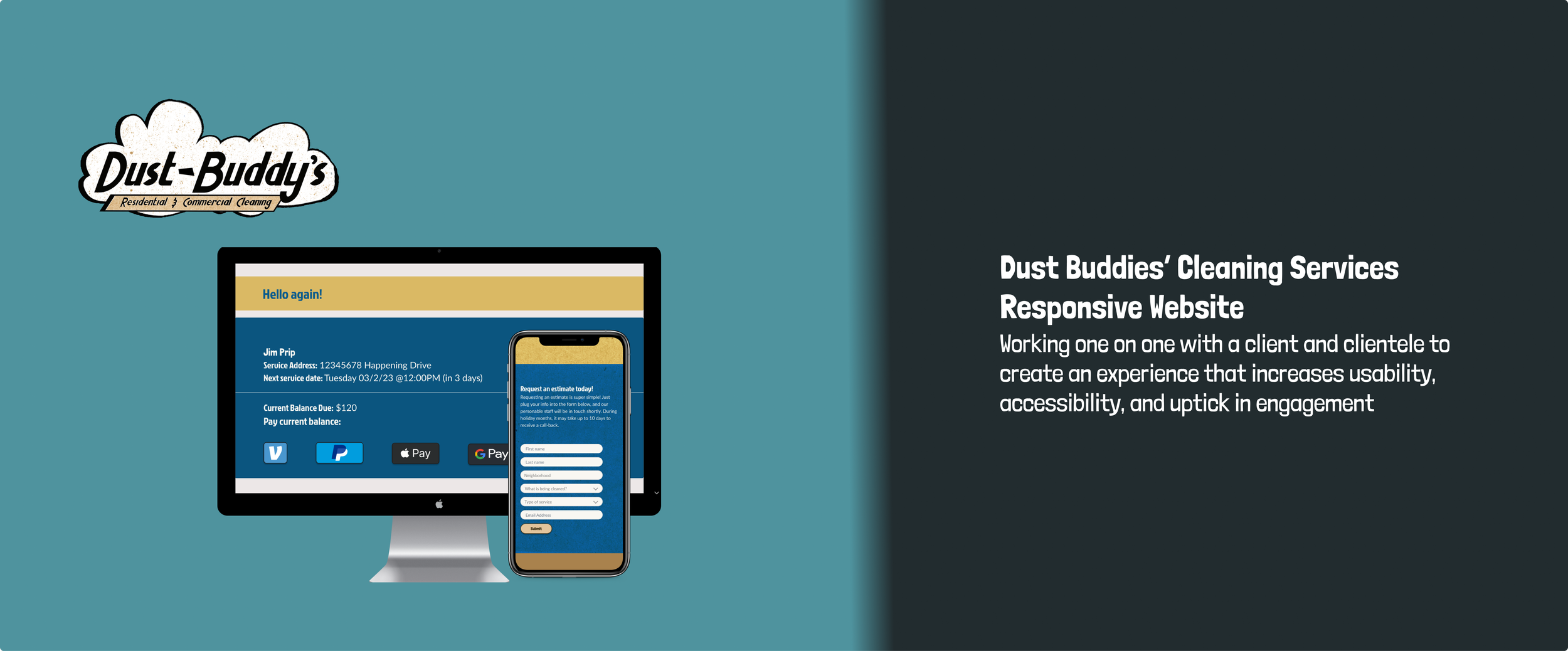
Overview: Dust Buddies’, A local cleaning company that thrives off of word of mouth and facebook groups, grows into finally requiring their own website. I wanted to create one that would eventually make communication easier for the customers and the owner
Problem: The company and clientele’s communication suffer because the only way to contact is through texting and email. There is also no website to send perspective clientele or customer referals.
Solution: Design a responsive website that can improve customer experience, communication, and increase clientele
Strategies: Start by discussing wants and needs with the owner. Look at other local and conglomerate websites. Afterwards, moving forwards with Interviewing different demographics among the current clientele to get insight to their past and present experiences. Testing the site on different clientele while venturing out to perspective clients to see how they feel.
Goals: Find the best way to sharpen communication and create an easy to use, transparent online experience. If this is executed properly the website can increase client uptick by having a place online where client’s can recommend others to check out.
DUST BUDDIES’ CLEANING SERVICES
Giving a Local Business the Online Presence it Deserves
Timeline: 4 weeks
Role: Researcher, Designer, Prototyper
Tools: Microsoft Office Suite; Miro; Figma
Research:
User Research:
I Interviewed current clientele about experiences with cleaning companies, why they hired Dust Buddies’, and experience with online bookings. I chose a range of different demographics Dust Buddies’ helps to try and get the widest perspective I could obtain. I felt that this would help with seeing if there are multiple problems clients have and any patterns within our clients answers.
Most of the user’s problems before hiring Dust Buddies’ came from the lack of time for leisure, lack of time spent cleaning, or lack of time to clean. The lack of time to clean created a stressful environment that made it hard for the client to relax. Dust Buddies’ Cleaning Services allowed clients to get their time back for spending it with family, mentally recover from being a first time parent, or being able to just work on hobbies outside of work and parenting. With this being a running theme throughout each of the interviews, it helped me start to shape how the website should function. Create a place that saves time rather than add to their already busy lives.
During the interviews I ended the interviews by asking the clients if they could tell me about an instance where a company’s website has ever deterred them from choosing the service or made them choose a competitor. Our clients would give a genuine ponder to the question, but could not think of a single instance where that was the case. With that being said, they mentioned reputation meant more than what a website looks like. Already knowing Dust Buddies’ reputation sat well with our clients based on how often the company gets new clients based on referrals from our current clientele, this bit of research allowed me to shift my focus into creating a space for referrals to have a place to get to know the company, and for current clientele to be able to take care of their business within a customer portal.
Click here for a more in depth analysis of my user research findings
Competitive Research:
I looked into these local and not to so local companies to be thorough. Websites like Expedia helped me become familiar with booking experiences online. I chose them because they have a good reputation. I kept most of the places I looked at local and branched out when the owner of the company recommended some sites that he has received inspiration from in the past.
Click here for a more in depth analysis of my competitive research findings


Results:
Unsurprisingly, client’s main motivations and interests lied in pricing and transparency. Surprisingly, people were interested in getting to know the actual people cleaning their house and wanting to know the company story. Both of these things help make their decisions to hire and whether or not they will stay consistent with their business. These things not only applied to cleaning, but buying/booking products and services in general.
Personas:
After covering the the research bases, we started synthesizing our information. I used abridged, multiple personas to create an easy to digest visual for the different demographics. A cleaning company services many different demographics so multiple personas worked best. I added quotes from the user interviews to add context. The bottom personas just needed descriptions because they umbrella the more specific user personas. I did not initially know how to properly approach this because of the range of demographics Dust Buddies’ serves. I looked at a previous persona I created and applied a similar visual method to showing the different categories people had problems with. Seeing that most clientele all averaged to have similar issues in one way or another, it helped me get an idea for who would use the website most and have the most trouble using it.
Empathy Map:
We created empathy maps after getting our ducks in row persona wise. We combined some direct results of the interviews and the personas we developed. This allowed us to get a visual of people’s needs, wants, and particular situations. Having all of this information easily organized made it easy to refer back to if need be. At this point I had already detailed accounts of user interviews and what folks were looking for in a cleaning services web presence. This exercise did not necessarily influence design, but it allowed me to further connect with the user. Which I believe is always worth taking time to do and will show in the finished product.
Ideation
Site Map:
While we switched it up a bit in the final product, the site map got the wheels turning for how the site architecture should look. It influenced the hierarchy of the website as well. The user and competitor research combined with the owner’s needs directly influenced my approach to the sitemap. Based on my research, I know prospective and current clients want simple, to the point information that reads as transparent with a dash of personal touch to it. The owner really wanting a current clientele to have a place to access their schedule, payments, etc. made it easy for me to have customer portal option for them. To make it even easier, he would create an automatic username for the client using first initial and last name.
Tap sitemap to get a better look
Design:
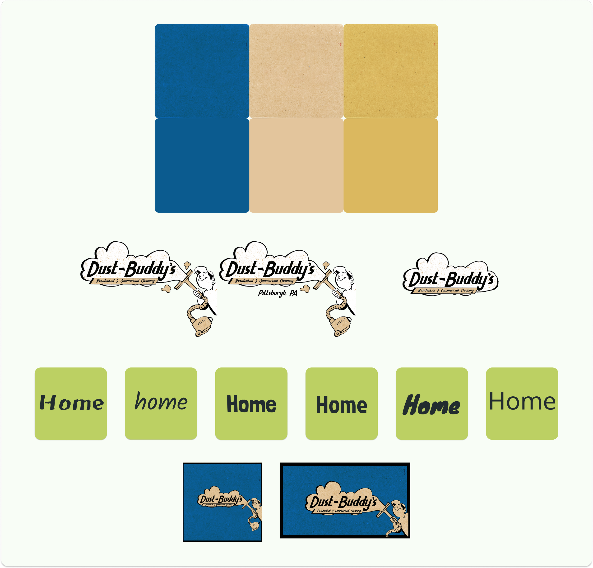
Style Guide:
The owner and I worked closely to create a style guide that mimicked the color and atmosphere he wanted for the site. It was a great way to learn how to creatively meet a client’s needs. It helped that the owner wanted to be hands on with the design process as well. We would hold weekly meetings with each other test out colors, textures, fonts, and feels to make sure we stayed on the same page. The owner wanted it to feel like a ‘long standing auto shop you’d find in your hometown.’ Which is where the specific and purposeful textures and style we chose came from. We grew up in the same hometown which made it fun to work together. The owner is also a well-known animator who works on music videos, short films, and creates his own art so that’s where the idea for the textured carpet/corkboard style of backgrounds we used came from.
Tap style guide to get a better look
Wireframes:
I went through low, mid, to high fidelity wireframes by getting a constant stream of feedback from the owner and colleagues. It felt a little intimidating not having a prompt or guide for designing the website for the first time. Although, already having textures, colors, backgrounds, and such already picked out helped immensely. Having such detailed research definitely helped as well. That’s why working so closely with the client and getting feedback from other designers remains important to me.
Click each picture to see how progress was made between low, mid, and high
Low Fidelity
Mid Fidelity
As previously mentioned, the owner and I further discussed things like assigning client’s account user names and passwords so they don’t feel like they need to make another account themselves. Thus continuing to save them time. As you can see details started to really take shape in the mid fidelity. These wireframes turned into a good practice writing copy and practicing hierarchy. I mentally prepped that while simultaneously discussing it with the owner. Spacing and size were also upgraded with mid fidelity. To me, this is really when the site started to take the most shape.
High Fidelity
The customer portal color decision after researching other scheduling/portal sites for other businesses during competitive research. Most seemed to serve a more function over form approach. Meaning that it doesn’t have to be dressed up fancy if it works well and is easy for users. While working with the owner, and keeping function over form in mind, we wanted to differentiate the portal. We did not want it to be completely different so the user would be confused. We wanted it to match the website, but let the user know that they were dealing with a different tool. So we came up with the idea of having solid colors that matched the textures on the website for the portal. Thus differentiating it without confusing the user.
Testing:
I tested with a different set of clientele while also testing perspective clients. I chose a few different candidates for testing to gain the widest perspective I could. I kept a wide range of demographics to make sure it was client friendly across the board. It ensured the best design and function results. I then ended up using a few clients from the user interviews to make sure what they were picturing matched a little of what I designed. Also, to make sure the functionality made sense to them.
Prototype:
The tasks were a combination of what features the owner and myself wanted to showcase right away. We synthesized our ideas with the research that came from the user interviews to put together the tasks chosen for usability testing and prototypes. We used the high fidelity wireframes to build out the prototypes.
Tasks
Requesting an estimate
rescheduling a clean
*Click each image for a closer look
Results:
I found that most people completed the tasks with ease. I got feedback on making rescheduling a little less ‘advertised’ or ‘encouraging’ since it could ultimately affect other clients’ schedules and the staff’s time. I also found that some language should be changed and that at the very least should be ‘a ballpark’ look at pricing developing a full price list. I broke down the following results visually, into different categories. It’s an easier, more pleasing way to get a look at our different users. The feedback grid is a more in depth way to look at our results.
Feedback Grid:
Worked:
Overall Design & Aesthetic
Buttons
Requesting an estimate
‘Previous’ & ‘upcoming’ tables for cleanings
Type of clean
Questions:
“What are ‘guidelines’?
“Do you have any base prices listed?”
“Does the company like to reschedule”
“What does resident type mean?”
“Have you thought of adding base prices or some kind of guide for price expectation?
Change
Change language with the rescheduling & estimate process
Add vaccinated? To ‘about’ or in customer questions
Change guidelines to a what you can expect from us/what we do and don’t do
Change drop downs to actual graphic calendar for rescheduling
Ideas:
Add bios & pics of employees to ‘about me’
Add urgency to rescheduling (possible fees & less overtly friendly language)
Add extra detailed drop downs for estimate request but do not make it mandatory
Referrals & gift cleans
Be more clear about the estimate process / walk new clients through it
Be clear about what information should be expected in follow up clean
Iterations:
Iterations were made based off of the feedback we received. Typically, I keep iterations and ideas very similar, but since I received a lot more feedback than usual and plan on building the rest of the website out, I had ideas expanded a bit outside of just the usual iterations that pertain to the prototypes already built out. I mainly changed some language and some of the aesthetics.
Tap each image for a closer look
Mobile Pages:
To further the accessibility for clients we are making sure the desktop pages translate correctly to mobile use. I understand that most clients will more than likely access the website through their phone rather than their computer. We need to make sure their is a responsiveness to the design. This will increase accessibility and inclusivity which should translate to an increase in clients and awareness of Dust Buddies’ services.
The Future and Next Steps:
With the information I gathered from research and usability tests, the owner and I can further expand the site with communication features, a database that can be created with the owner, and automation features. These will be developed to not only make a more convenient experience for the client, but a more convenient experience for the owner as well. I believe building out the portal a little further and creating the database with the owner will be the next steps I take after I complete UX Academy. My plan is to make a few more iterations, make the site live, and continue to update it accordingly.